TL;DR

Get business pricing on your home office setup
- Business-only prices and quantity discounts
- Tax-exempt purchasing
- Multiple users, one account, clear invoices
Toronto framing expert Tara Gavin says a gallery wall works best when it has a clear design direction. Her approach uses varied frame finishes, colored mats, considered spacing and, in some cases, black-and-white photographs to create a cohesive display.
Framing expert Tara Gavin, founder of Toronto’s On the Wall Framing, has outlined how she plans gallery walls: start with a clear design direction, then use frame finishes, mat colors, spacing and image choices to give the display cohesion. The advice, reported by House Beautiful, draws on a project for a Toronto family that used a wall only 31 inches wide.
Gavin said her team works with scale, unexpected mat colors and different frame finishes, as well as how photographs sit inside their frames. For the Toronto project, commissioned by design studio Kessler Levitan for a family of five, she combined oak and black frames with burgundy mats and frames. Gavin said the palette was intended to add warmth while keeping the arrangement from feeling too formal.
She also recommends treating the mat—the border between an image and its frame—as part of the composition. A wider mat can give a small photograph more presence, while multiple images in one frame or a photograph placed slightly off-center can make an arrangement feel less predictable. Gavin described these as options rather than rules that every gallery wall must follow.
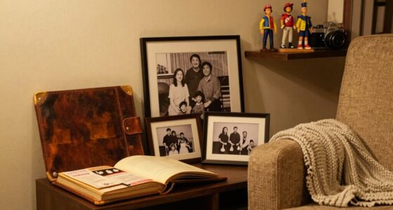
For collections of family pictures made under different lighting conditions, Gavin said printing the images in black and white can help them look more consistent together. She used monochrome photographs in the featured project while adding color through the frames and mats. The source does not say that black-and-white printing is necessary for every wall; it presents it as one way to unify a varied group of images.
A Plan for Small or Mixed Displays
The advice offers readers a way to make a gallery wall feel deliberate without relying on a set of matching frames or expensive artwork. A consistent visual plan can connect photographs that differ in size, age or color, while mats and frame finishes let homeowners adjust the display to suit the room.
The 31-inch-wide project also shows how Gavin applied those choices to a constrained space. Rather than treating limited width as a reason to avoid a gallery wall, she used the arrangement as a design feature. That example is specific to her project, but the underlying choices—color, scale, spacing and image treatment—are practical factors readers can plan before hanging pictures.
Popular right now

KitchenAid Classic Series 4.5 Quart Tilt-Head Stand Mixer K45SS, Onyx Black

De’Longhi Classic Matte Black Espresso Machine with Milk Frother

Bose QuietComfort True Wireless Earbuds with Active Noise Cancellation, Black
As an affiliate, we earn on qualifying purchases.
Inside Gavin’s Toronto Project
The House Beautiful report centers on a wall Gavin designed for a Toronto family of five, working with design studio Kessler Levitan. The available width was 31 inches. The project paired burgundy accents with familiar oak and black frames, and used black-and-white family photographs to bring consistency to images made at different times.
Gavin’s guidance is based on her framing practice, not a formal study or a universal design standard. House Beautiful presents the project as an example of her approach and includes her recommendations on mats, color and composition. The report does not provide a full installation plan or measurements for spacing the frames.
“My team and I love playing with scale, unexpected mat colors, different frame finishes, and the way photographs are positioned within a frame in order to keep them fresh.”
— Tara Gavin, founder of On the Wall Framing, as quoted by House Beautiful
Advice, Not a Fixed Formula
The report does not give a single layout template, exact frame dimensions, spacing measurements or a step-by-step hanging sequence. It is also unclear whether Gavin recommends the same palette or monochrome treatment for other rooms; her comments describe choices made for one project and options that can be adapted.
House Beautiful’s source material does not include independent testing or reader results comparing gallery-wall approaches. The design effects described—such as added warmth or a more cohesive appearance—are Gavin’s professional judgments, not measured outcomes.
Apply the Choices to Your Wall
For readers planning a display, the report points to a sequence of decisions rather than a prescribed finished look: select a direction for the collection, consider how frame and mat colors relate to the room, and decide whether varied photographs would benefit from black-and-white printing. Mat width, image placement and the use of more than one photo in a frame can then shape the composition.
No additional project or follow-up announcement is identified in the source. The next step for homeowners is to adapt Gavin’s recommendations to their own photographs, available wall space and furnishings; the article does not claim that one palette or arrangement will suit every interior.
Key Questions
What does Tara Gavin mean by a gallery wall having a design direction?
She means making deliberate choices about scale, mat colors, frame finishes and photo placement so the pieces work together as a display. Her example combined burgundy, oak and black rather than using only matching white mats and wood frames.
Do gallery-wall photographs need to be printed in black and white?
No. Gavin recommends black-and-white printing as an option, especially when family photographs come from different times and lighting conditions. She says it can help create visual consistency, but the report does not present it as a requirement.
How can mats change the appearance of a gallery wall?
Mats create space around an image and can make a small photograph feel more prominent. Gavin also suggests using multiple openings in one frame or placing images slightly off-center to vary the arrangement.
Can these ideas work on a narrow wall?
Gavin’s example was designed for a wall with 31 inches of width, showing how she used color and composition in a constrained area. The report does not give a universal layout or measurements for other narrow walls, so the arrangement would need to be adapted to the available space.
Source: housebeautiful.com