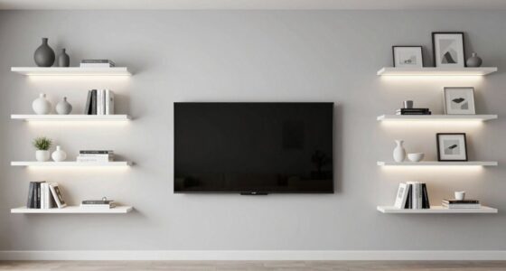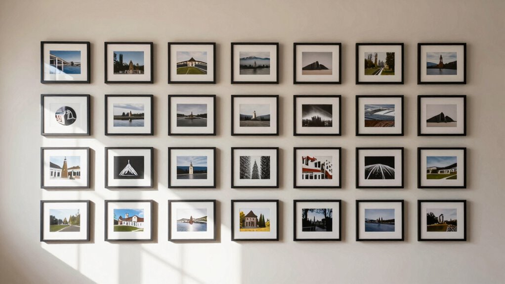

If your gallery wall feels off, it’s likely due to improper spacing. When you keep gaps inconsistent or go too tight or wide, it creates clutter or disjointedness. Achieving a polished look means maintaining even spacing, around 2–4 inches, and planning your layout carefully before hanging. You’ll notice everything comes together when you understand how spacing highlights your art and frames. Stick with this guide to learn the key tricks behind perfect gallery wall spacing.
Listen free for 30 days with Audible
Thousands of audiobooks and originals — cancel anytime.
As an affiliate, we earn on qualifying purchases.
Key Takeaways
- Inconsistent spacing disrupts visual flow, making the gallery feel cluttered or disjointed.
- Lack of a clear layout plan causes uneven gaps and imbalance in the arrangement.
- Ignoring room proportions and wall dimensions can make spacing appear awkward.
- Mismatched frame styles or colors can clash, emphasizing poor spacing choices.
- Proper measurement and marking are essential for achieving harmonious, balanced gaps.
gallery wall picture frame spacers
As an affiliate, we earn on qualifying purchases.
As an affiliate, we earn on qualifying purchases.
Why Proper Spacing Creates a Polished Gallery Wall
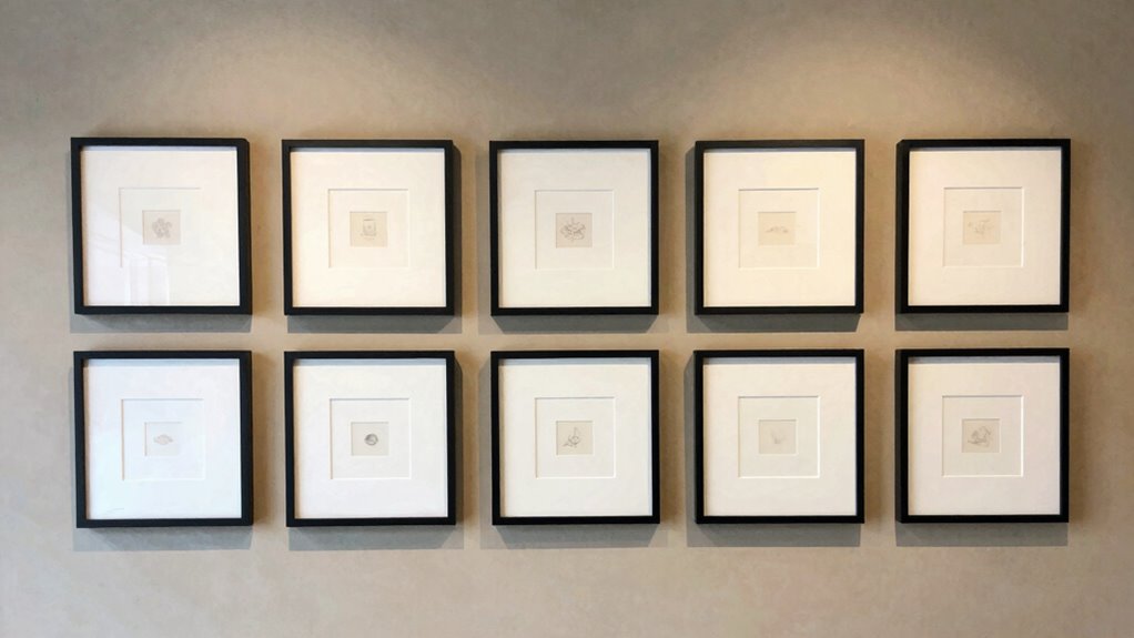
Proper spacing is essential for creating a polished gallery wall because it guarantees that each piece has room to breathe and contributes to an overall balanced look. When you pay attention to spacing, you allow your color coordination to shine, ensuring no piece overwhelms the others. Consistent gaps help highlight the harmony of different frame styles, whether sleek modern or ornate vintage. This balance makes your gallery visually appealing and cohesive. If the spacing is too tight, the wall feels cluttered; too wide, and the collection looks disjointed. By carefully considering both spacing and how your frame styles complement each other, you create a unified display that feels intentional and polished. Understanding the visual balance of your arrangement is key to achieving a harmonious display. Proper spacing transforms your gallery from a random collection into a stunning focal point.
As an affiliate, we earn on qualifying purchases.
Common Mistakes That Make Your Gallery Feel Off

One of the most common mistakes that can make your gallery feel off is inconsistent spacing between frames. When spacing varies, the entire display feels unbalanced, distracting the eye. Additionally, neglecting color coordination can cause chaos instead of harmony, making the gallery look disorganized. Using mismatched frame styles can also contribute to an off-kilter appearance, especially if they clash or seem haphazardly chosen. To avoid this, stick to a consistent spacing pattern, whether uniform or intentionally varied, and choose frames that complement each other in color and style. Mixing frame styles can work if done thoughtfully, but visual balance and intentionality are key to preventing a cluttered look. Paying attention to spacing, color coordination, and frame styles helps your gallery look intentional and cohesive, rather than mismatched or chaotic. Proper gallery arrangement techniques can help you achieve a polished and harmonious display. Ensuring your display maintains symmetry can also enhance overall harmony and prevent visual tension. Recognizing the importance of aesthetic consistency can further elevate your gallery’s overall appeal. Incorporating a clear layout plan can also make your gallery feel more intentional and visually appealing.
As an affiliate, we earn on qualifying purchases.
Basic Rules for Achieving Balanced Gallery Wall Spacing

Achieving balanced gallery wall spacing begins with establishing clear guidelines for how far apart your frames should be. Keep consistent spacing between frames to create harmony; generally, 2 to 4 inches works well. Consider color coordination by grouping similar hues or contrasting bold colors to add visual interest. When selecting frame material, aim for a cohesive look—mixing metals with woods can work if they share a similar finish or tone. Avoid overcrowding; leave enough space for each piece to stand out without feeling cramped. Symmetry isn’t always necessary, but maintaining a balanced arrangement helps prevent the wall from feeling off. By focusing on consistent spacing, thoughtful color coordination, and complementary frame materials, you’ll create a gallery wall that feels intentional and visually appealing.
frame spacing ruler for art display
As an affiliate, we earn on qualifying purchases.
As an affiliate, we earn on qualifying purchases.
Measuring and Marking for Perfect Wall Arrangements

Once you’ve set your guidelines for spacing and arrangement, the next step is to measure and mark your wall accurately. Use a level and a tape measure to guarantee consistent spacing between frames, considering your chosen frame styles and overall layout. Start by marking the center point of your arrangement to help align the entire gallery. Pay attention to color coordination—if you plan to group similar hues or contrasting shades, mark these sections carefully to maintain harmony. Lightly pencil in your reference points and spacing lines, making adjustments as needed before hanging. Precise measurement and clear markings prevent uneven gaps and misaligned frames, ensuring your gallery wall looks intentional and polished. Incorporating a measuring tools like a ruler or painter’s tape can further improve accuracy and spatial arrangement. Being aware of room proportions can also help you create a balanced display that complements your space. Additionally, understanding wall dimensions ensures your layout fits well within your available space without feeling cramped or overly sparse. Familiarity with wall space planning can help you visualize the final look before committing to placement.
The Simple Trick to Perfect Gallery Wall Spacing
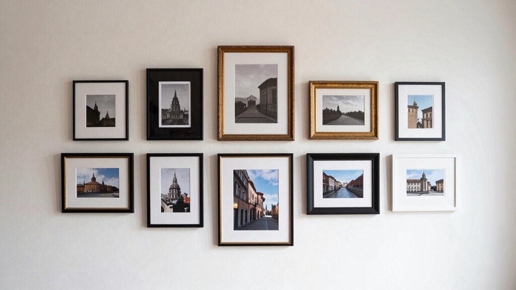
A simple trick to guarantee perfect gallery wall spacing is to use painter’s tape to outline your frames directly on the wall. This visual guide helps you see the layout before hanging, ensuring even spacing and alignment. To make your gallery cohesive, consider color coordination—select a palette that complements your room’s decor. Play with frame styles, mixing textures and finishes for visual interest, but keep the spacing consistent. Use the tape outlines to experiment with different arrangements, adjusting as needed. This method minimizes mistakes and saves time. Remember, maintaining uniform gaps between the outlines creates a balanced look. Incorporating biodiversity principles into your interior design can inspire eco-friendly choices, such as sustainable materials for frames. Once satisfied, hang your frames confidently, knowing your spacing is spot on. This simple trick elevates your gallery wall’s overall harmony and style.
Mixing Frame Sizes and Artwork Without Clutter

Mixing frame sizes and artwork is a great way to add visual interest to your gallery wall, but it can quickly become cluttered if not done thoughtfully. To keep it cohesive, focus on color coordination and frame styles. Use a consistent color palette to unify diverse artworks, making the arrangement feel intentional. Combine different frame styles—like sleek metal with ornate wood—while maintaining similar finishes or tones to avoid visual chaos. Here’s an example layout:
| Large Statement | Small Accents |
|---|---|
| Medium-sized | Varying sizes |
| Artwork with bold colors | Subtle or monochrome pieces |
| Mix of textures | Uniform matting |
This balance prevents clutter, letting each piece stand out while creating harmony.
Troubleshooting a Gallery Wall That Still Feels Off

If your gallery wall still feels off despite careful planning, it’s time to evaluate what’s causing the imbalance. Sometimes, the issue lies in inconsistent color coordination or mismatched frame styles. These elements can create visual confusion and disrupt harmony. Check if the frames clash or if the artwork’s colors feel jarring. Adjusting frame styles to unify your collection or choosing a cohesive color palette can make a big difference. Also, consider spacing and alignment—uneven gaps might be the culprit. Sometimes, small tweaks like swapping out a frame or changing artwork placement can restore balance. Remember, the goal is a harmonious display that guides the eye smoothly across your wall.
- Inconsistent color coordination
- Mismatched frame styles
- Uneven spacing or alignment
- Clashing artwork and frame choices
Frequently Asked Questions
How Do I Choose the Right Wall for My Gallery?
You should choose a wall that has enough space and is visually appealing for your art arrangement. Look for a wall with good lighting and a neutral background to highlight your pieces. Consider the wall’s size and shape to guarantee your gallery will fit well without feeling crowded or sparse. Selecting the right wall creates a balanced, cohesive look that makes your gallery wall stand out and feel intentional.
What Tools Are Best for Measuring and Marking Spacing?
Did you know that improper spacing can make a gallery wall look uneven? For measuring techniques, a tape measure or ruler works best for accuracy. For marking methods, use painter’s tape or painter’s putty to temporarily hold pieces in place. A level helps keep everything straight, and a pencil is perfect for marking spots. Combining these tools guarantees your spacing is consistent, giving your gallery a professional, cohesive look.
How Do I Update My Gallery Wall Over Time?
To update your gallery wall over time, start by re-evaluating your gallery arrangement and considering new frame styles that complement your existing decor. Remove or rearrange frames for a fresh look, and mix different sizes or textures to add interest. Use painter’s tape to experiment with placements before hanging new pieces. Regular updates keep your gallery wall feeling current and personalized, reflecting your evolving taste and style.
Can Gallery Wall Spacing Differ Between Rooms?
Yes, gallery wall spacing can differ between rooms. You might opt for tighter arrangements in smaller spaces to create wall harmony, while larger rooms can handle more spread-out art arrangements for visual balance. Adjusting spacing based on room size and furniture placement helps guarantee your art arrangement feels cohesive. When spacing varies, it enhances the overall aesthetic, making each room feel intentional and well-designed without disrupting the gallery wall’s harmony.
What Are Creative Ways to Incorporate Non-Framed Art?
Imagine your wall as a canvas, bursting with life. To keep it vibrant, try unconventional displays—think hanging a tapestry or stringing fairy lights around your art. Mix media like textiles, metal, or even found objects to add texture and personality. These bold choices break the mold, making your space uniquely yours. Incorporate non-framed art by blending different pieces, creating a dynamic, inspiring gallery that feels both curated and spontaneous.
Conclusion
Remember, a gallery wall is like a puzzle — every piece needs its perfect place. When you pay attention to spacing, it transforms chaos into harmony. Don’t be discouraged if it feels off at first; even the best artists had to learn their brushstrokes. As the saying goes, “Rome wasn’t built in a day.” Keep tweaking, and soon your wall will feel just right — balanced, beautiful, and uniquely yours.
NFL season / tailgating Picks
team gear
As an affiliate, we earn on qualifying purchases.