Choosing the right wall color can dramatically improve your projector’s picture quality, but many overlook how surface finish, color, and ambient lighting affect clarity, contrast, and color accuracy. Lighter or glossy walls reflect light and dull images, while darker, matte tones absorb excess light, boosting contrast. Testing different shades in your space helps you avoid surprises. If you want to discover how to optimize your setup further, keep exploring these essential tips.
Key Takeaways
- Matte, smooth wall surfaces with neutral, darker tones enhance contrast, color accuracy, and reduce glare for better projected image quality.
- Bright or glossy walls reflect excess light, washing out images and decreasing contrast; avoid high-reflectivity finishes.
- Testing various wall colors and finishes in different lighting conditions helps predict real-world projection performance.
- Darker wall colors absorb ambient light, improving contrast, but should be paired with proper ambient light control.
- Avoid bright white or overly vibrant walls, as they reflect too much light, diminishing image clarity and color fidelity.
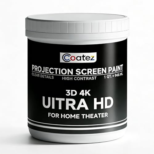
COATEZ Ultra HD Premium Projector Screen Paint with 1.6 Gain (1 QT./ 946 ML)| Single-Coat Projector Paint For Picture Perfect 3D 4K UHD Clarity | Interactive Projector Wall Paint for Indoors
Covers 130-140 sq ft with 1 coat—perfect for home theaters, media rooms, classrooms, and office presentations.
As an affiliate, we earn on qualifying purchases.
As an affiliate, we earn on qualifying purchases.
Why Wall Color Can Make or Break Your Projector Experience

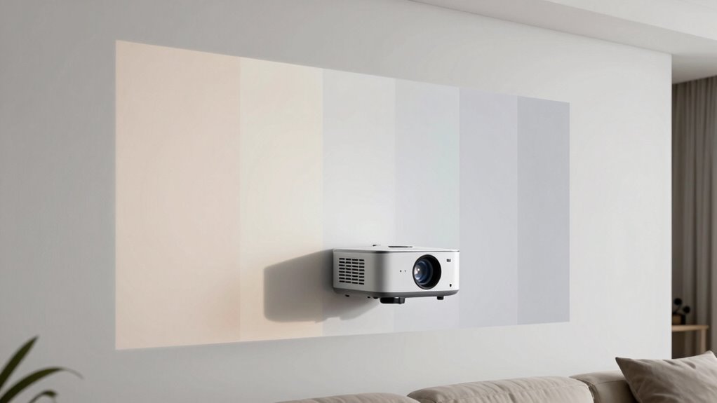
Your wall color plays a crucial role in how well your projector images appear. The wall’s texture can influence image clarity—smooth walls reflect light evenly, making pictures sharper, while rough or textured surfaces cause distortions or dullness. Ambient lighting also impacts your viewing experience; too much light can wash out images, regardless of color, while dim lighting enhances contrast and color vibrancy. Light-colored or matte walls help diffuse light evenly, reducing glare and preventing hotspots. Conversely, glossy or highly textured walls can create unwanted reflections and uneven image quality. By choosing a wall surface with a smooth, matte finish and controlling ambient lighting, you set the foundation for a better, more immersive viewing experience. Proper wall surface selection can significantly improve your viewing clarity, making your projector experience more enjoyable and immersive. Understanding how projector image quality interacts with your wall surface can help you optimize your setup for the best possible picture. Additionally, considering environmental factors like room size and furniture placement can further enhance your overall viewing environment. Adjusting your wall color and texture according to these lighting considerations can also drastically improve your viewing experience. For example, the room’s lighting environment can alter how well your projector images appear, making it essential to tailor your setup accordingly. Proper wall color and texture choices, combined with controlled lighting, directly affect your projector’s performance.
COATEZ Ultra HD Premium Projector Screen Paint with 1.6 Gain (1 QT./ 946 ML)| Single-Coat Projector Paint For Picture Perfect 3D 4K UHD Clarity | Interactive Projector Wall Paint for Indoors
Covers 130-140 sq ft with 1 coat—perfect for home theaters, media rooms, classrooms, and office presentations.
As an affiliate, we earn on qualifying purchases.
As an affiliate, we earn on qualifying purchases.
How Wall Color Affects Brightness, Contrast, and Color Accuracy

Your wall color directly influences how bright your projector image appears and how well you see contrast and colors. Light-colored walls can wash out details, while darker shades often boost contrast but may reduce overall brightness. Considering contrast techniques and choosing the right hue helps guarantee accurate color reproduction and a better viewing experience. Additionally, selecting a wall finish with a matte surface can minimize glare and enhance image clarity, especially in a trendy lifestyle setting. To optimize your setup, understanding projector screen principles can help you make more informed decisions about wall treatments and positioning. Being aware of ambient light management can further improve image quality by reducing external light interference. Recognizing the impact of wall surface texture can also contribute to clearer images by minimizing surface reflections. Moreover, understanding color theory can assist in selecting the most suitable wall shades to enhance your viewing environment.
Wall Color Brightness Impact
The color of the wall behind a projector can considerably influence how bright, contrast-rich, and true-to-life the images appear. A darker wall absorbs excess light, enhancing brightness and contrast, while a lighter wall reflects more light, reducing image quality. Your choice impacts wall color psychology, affecting your perception of the viewing experience. Additionally, projector screen materials interact with wall color, amplifying or diminishing brightness. To maximize brightness impact:
- Opt for matte, dark hues like gray or navy for better light absorption.
- Avoid glossy or overly bright colors that reflect unwanted light.
- Consider wall color psychology to create an immersive environment.
- Match wall color with projector screen materials for superior contrast.
- Being mindful of wall color psychology helps ensure your projector delivers vivid images with accurate color performance.
Contrast Enhancement Techniques
How does wall color influence contrast and color accuracy in your viewing setup? Your projector wall color plays a key role in contrast enhancement, which affects how vivid and detailed images appear. A darker wall color, like matte gray or charcoal, absorbs excess light and improves contrast by preventing glare, making blacks deeper and whites brighter. Conversely, bright or reflective colors diminish contrast, washing out details. To optimize contrast enhancement, choose a wall color that minimizes ambient light reflection while enhancing the projector’s output. Proper wall color selection is essential for achieving sharp, well-defined images with accurate color reproduction. Additionally, ambient light control is crucial, as even the best wall color cannot compensate for uncontrolled light sources. Remember, the right projector wall color can greatly elevate your viewing experience by enhancing contrast and ensuring clearer, more vibrant visuals.
Color Accuracy Considerations
Choosing the right wall color is essential because it directly impacts brightness, contrast, and color accuracy in your projection setup. Light, neutral shades tend to enhance color fidelity, while darker hues can diminish brightness. Color psychology plays a role here—softer colors reduce eye strain and improve focus. Wall texture also matters; smooth surfaces reflect light evenly, preserving color accuracy. To optimize your setup, consider:
- Using matte finishes to minimize glare and uneven reflections
- Selecting neutral colors such as gray or beige for true color reproduction
- Avoiding overly vibrant or saturated hues that distort projected colors
- Considering wall texture to ensure consistent light reflection and sharp contrast
- Paying attention to wall reflectivity to maintain optimal brightness and color consistency throughout your viewing area
COATEZ Ultra HD Premium Projector Screen Paint with 1.6 Gain (1 QT./ 946 ML)| Single-Coat Projector Paint For Picture Perfect 3D 4K UHD Clarity | Interactive Projector Wall Paint for Indoors
Covers 130-140 sq ft with 1 coat—perfect for home theaters, media rooms, classrooms, and office presentations.
As an affiliate, we earn on qualifying purchases.
As an affiliate, we earn on qualifying purchases.
Test Your Wall Colors Before Committing to a Final Shade
Before settling on a wall color, use test swatches to see how they look in your space. Keep an eye on how different lighting conditions change their appearance throughout the day. This way, you can make an informed decision and avoid surprises once the paint is applied. Additionally, consider how digital displays and projectors can influence your perception of wall colors, helping you choose shades that complement your tech setup. Understanding color perception can further assist in selecting the most suitable hue for your environment. Being aware of visual ergonomics can also help optimize your space for both aesthetics and functionality. Recognizing how lighting conditions impact color appearance can improve your overall decision-making process. Exploring text case conversion tools can aid in creating clear and consistent labels for your design documentation, ensuring everyone understands your color references.
Use Test Swatches
Testing small swatches of your wall color is an essential step to guarantee you’re happy with the shade before committing to painting the entire space. This helps you see how different wall paint finishes impact the look and feel of your room, especially under various ambient lighting conditions. To make the most of your test, consider these tips:
- Apply swatches in multiple areas with different lighting to observe how shades change.
- Use a variety of wall paint finishes, like matte or semi-gloss, to see their effects.
- Keep the swatches on the wall for several days to notice subtle color shifts.
- Compare the swatches against your projector screen to evaluate how the color interacts with projected images.
This process assures you select the perfect shade for your space.
Observe Lighting Effects
Lighting plays a crucial role in how your wall colors appear, so it’s necessary to observe how different lighting conditions affect your swatches before finalizing your choice. Ambient lighting, whether natural or artificial, can substantially change the perceived shade, making some colors look warmer or cooler. To properly assess, move your swatches around your space at different times of day and under various lighting setups. Pay attention to your wall’s texture, as rough or uneven surfaces can reflect light differently, altering the color’s appearance. Test your chosen shades in both bright and dim settings to ensure they look good in all conditions. This step helps prevent surprises once you install your projector wall and guarantees the color enhances your viewing experience.

QTU TV LED Backlight with Sensor, LED Sync Lights for TV 55-65 Inch, Smart Camera Sync to Screen, Ambient RGB Strip Lights for Gaming & Home Theater, App Control (14.7ft)
【Zero-Lag Sync for Home Theater】Transform your living room into a cinematic hub with our TV LED backlight with…
As an affiliate, we earn on qualifying purchases.
As an affiliate, we earn on qualifying purchases.
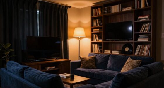
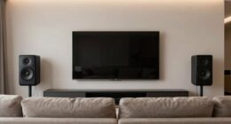
Choosing the Best Wall Color for Your Home Theater Setup
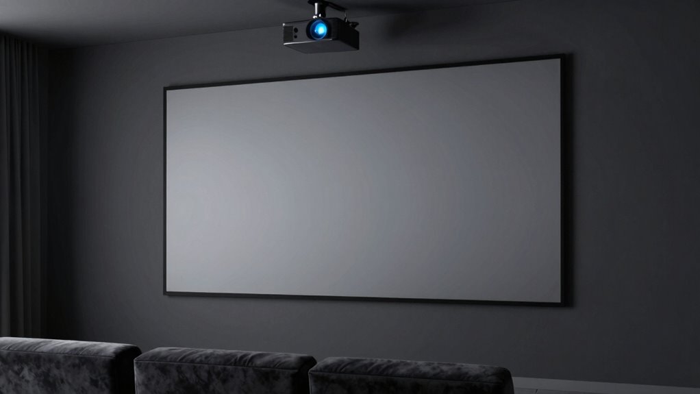
Choosing the right wall color is vital for creating an immersive home theater experience, as it directly impacts picture quality and overall ambiance. Opt for matte finishes to reduce glare and avoid reflective surfaces that can distort images. Consider wall texture; smooth, flat surfaces work best for even light absorption, while textured walls may cause uneven reflections. Ambient lighting plays an important role—opt for darker, neutral shades like charcoal or muted gray to minimize light interference and enhance contrast. Bright or saturated colors can distract and diminish picture clarity. To optimize your setup, prioritize colors that absorb light, complement your ambient lighting, and suit your wall texture. Incorporating automated lighting controls can further help manage reflections and ambient light for a more consistent viewing experience. Additionally, understanding wall textures can help you choose the most suitable surface for your home theater. Being aware of color psychology can also help you select hues that create a cozy, focused atmosphere conducive to movie watching. This careful selection ensures your projector’s image remains sharp and vibrant, delivering an authentic cinema experience.
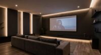
How Light Reflection and Wall Finish Impact Image Quality
Ever wondered how the finish of your wall can influence your home theater experience? Light reflection plays a key role. A matte or flat wall finish reduces unwanted glare, ensuring your projector’s image stays crisp. Conversely, glossy finishes reflect more ambient lighting, causing distractions and reducing contrast. Wall texture also matters; smooth surfaces provide better image clarity, while textured walls can scatter light and diminish quality. Managing ambient lighting is crucial—bright lights can wash out your projection regardless of wall finish. To optimize your setup, consider a finish that minimizes reflections and textures that promote even light absorption. Additionally, understanding wall surface properties can help you choose the most suitable finish for your environment, especially since different surface textures can significantly influence light behavior and image quality. Recognizing the impact of light reflection can guide you in selecting the right wall surface to enhance your viewing experience. Moreover, selecting surfaces with appropriate reflectivity levels can further improve projection clarity and contrast.
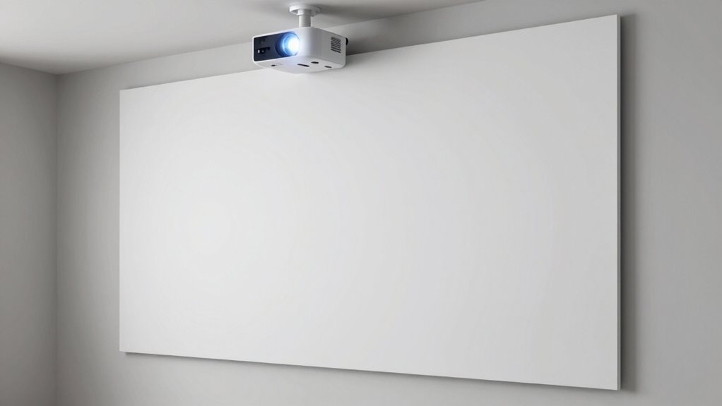
Colors to Avoid on Your Walls for Better Projection Results

Certain wall colors can substantially hinder your home theater experience by causing unwanted reflections or reducing contrast. Bright or dark hues may interfere with projector calibration, making it harder to achieve *ideal* image quality. Additionally, colors with strong wall color psychology, like vibrant reds or intense blues, can distort perceived brightness and color accuracy. To improve projection results, avoid:
- Bright white, which reflects too much light and washes out images.
- Dark or saturated colors, such as deep reds or blacks, that absorb light and reduce contrast.
- Bold or overly vibrant shades, which can introduce color distortion.
- Highly reflective or glossy finishes that cause glare and unwanted reflections.
Sticking to neutral, matte tones helps maintain true color reproduction and better contrast, ensuring your projector performs at its best.
Tips for Painting or Covering Walls to Enhance Your Viewing Experience
To maximize your projector’s performance, selecting the right wall treatment is key. Start by choosing a smooth wall texture, like drywall or a lightly textured surface, to prevent image distortion and maintain sharpness. Avoid heavily textured walls, which can scatter light and reduce clarity. Covering your walls with matte paint in a neutral, dark hue helps absorb excess ambient lighting, minimizing glare and enhancing contrast. If painting isn’t an option, consider using a projector screen or fabric wall coverings designed for ideal projection. Additionally, controlling ambient lighting is essential; dim or eliminate ambient sources to prevent washout and improve image quality. Combining a proper wall surface with controlled lighting creates a perfect environment for a sharp, vibrant projection.
Frequently Asked Questions
Can Wall Texture Affect Projector Image Quality?
Yes, wall texture can affect your projector image quality. Rough or uneven surfaces cause light diffusion, leading to blurry or inconsistent images. Smooth, flat walls reflect light evenly, enhancing clarity. You should also calibrate your projector properly to adjust for surface variations. Clear, flat walls combined with correct calibration improve image sharpness, color accuracy, and overall viewing experience, making your setup much more enjoyable.
Are There Specific Wall Colors Better for Short-Throw Projectors?
Yes, certain wall colors are better for short-throw projectors. Opt for projection surfaces in light, neutral shades like matte gray or beige, as they enhance color saturation and contrast without creating glare. Bright or dark colors can distort image quality, so avoid them. A smooth, matte finish helps prevent reflections, ensuring sharp, vibrant images. Choose a wall that minimizes color interference for the best viewing experience.
How Does Ambient Lighting Influence Wall Color Choices?
Think of your room as a stage—ambient light is the spotlight, and your wall hue sets the scene. Bright ambient light washes out projector images, so opt for darker wall colors to absorb excess light and enhance contrast. I once watched a movie in a room with strong sunlight, and a dark blue wall made the visuals pop. Adjusting wall hue based on ambient light levels improves your viewing experience considerably.
Can Wall Color Impact Sound Quality in a Home Theater?
Yes, wall color can impact sound quality in your home theater. Light-colored, reflective walls tend to bounce sound waves, reducing sound absorption and causing echo. Darker, matte finishes help absorb sound and improve acoustic treatment. Choosing a color that enhances sound absorption can make your audio experience clearer and more immersive, especially when combined with proper acoustic treatment. So, wall color plays a surprisingly important role in your theater’s sound quality.
Is It Better to Use Paint or Wall Coverings for Projection?
Think of your wall as a stage for your projector’s performance. Using paint is like choosing a simple set, offering a smooth, even surface for clear images. Wall coverings are like elaborate curtains, adding texture but sometimes causing projection myths if not properly prepared. For best results, prioritize wall preparation—optimize surface smoothness and color—whether you pick paint or coverings. This guarantees your projection shines bright and true.
Conclusion
Choosing the right wall color can dramatically improve your projector experience, providing clearer images and more vibrant colors. Did you know that a neutral gray wall can enhance contrast by up to 30% compared to white? By testing different shades and avoiding reflective or glossy finishes, you’ll create a more immersive home theater. With just a bit of effort, you can transform any space into the perfect viewing environment—so don’t underestimate the power of your walls!